KIBA
Bridging Communication Gaps in Pediatric Emergency Rooms
A playful, bilingual app helping 3–8-year-olds express emotions and get timely translation in pediatric ERs


Children (ages 3–8) from intercultural, ESL households struggle during emergency visits—not because of the treatment itself, but because communication barriers lead to escalated emotions and unsafe interactions.
BUT medical staff rely on language lines that are adult-oriented and slow to use,
THEREFORE we set out to design a more accessible, emotionally intuitive system for both children and caregivers.
Who
3 to 8-year-old patients in intercultural and English as-a-second-language households.
What
Computer-based interventions with a focus on low-literacy training in emergency preparedness.
Where
The interventions will be implemented in the emergency departments of both Children’s Hospital of Philadelphia and St. Christopher’s Hospital for Children.
Why
The primary objective is to minimize communication barriers, as they contribute to the intensification of behaviors and create unsafe clinical interactions
15+ interviews: doctors, nurses, social workers, parents, and children
🔍 Key Findings
Kids often became the translators (emotionally unsafe)
Parents feared misdiagnosis due to accent or misunderstanding
Translation services were clunky during emergencies
💡 Design Goals
Reduce cognitive and emotional load for kids
Simplify and visualize medical communication
Empower children to participate without needing language mastery
We brainstormed 25+ ideas and tested three
📱 Interactive Storytelling App
Child-friendly narratives & animations to explain ER processes
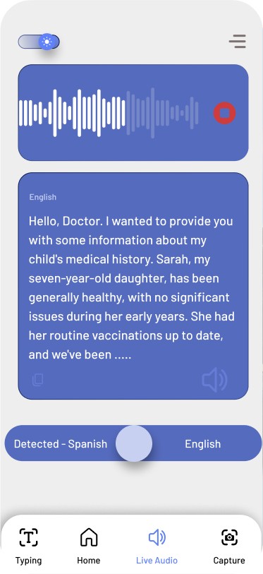
🔊 Mobile Translation Device
Real-time, sentence-level translation with kid-friendly
🧩 3D Models
Tactile learning tools to familiarize kids with tools like thermometers or X-ray machines
Usability tests with 5 kids and 3 nurses revealed
Kids preferred characters and animations over static images
Nurses found this translation better than current procedures
Breathing exercises helped kids calm down before triage
Takeaway: Combining utility + emotional reassurance = a safer, calmer ER experience
This project taught me to lead with empathy, especially when designing for vulnerable users. It sharpened my skills in research synthesis, storytelling design, and prototyping under real-world constraints. It also reminded me how small design changes can deeply affect care quality and human dignity.
👩🎨 My Role
I led the design strategy, conducted user interviews, built low- and high-fidelity prototypes, and synthesized testing feedback into actionable design decisions. I also facilitated team workshops and stakeholder reviews.
🔮 What I’d Do Differently
Explore non-digital interventions like sensory boards or music
Build in feedback loops for kids to “teach back” what they learned
Involve nurses earlier—their feedback was critical and could’ve saved time